Artistically-gay’s Hair Tutorial
artistically-gay’s Hair Tutorial

So! before we begin, I wanna state that the program I use is Fire Alpaca, though this tutorial can be applied to different art programs as well! Some brushes and filters may work a bit differently from program to program.

First, we need to go over the brush checklist! These are the brushes you’re going to be working with: - Watercolor 1 (Turn ON size by pressure) - Watercolor 2 (Turn OFF size by pressure) - Airbrush
We’ll start off with a base color. A lightish color is the easiest to work with when you start out. A caramel color should work best for practice.

You’re going to want to duplicate the color layer. The duplicated layer is where most of the coloring is going to be done. Lock the first layer to make sure you don’t accidentally work on the wrong layer. I’ve had this accident several times and ended up wasting an hour or two.
You’ll need to have an understanding of color theory for this, but I’ll be linking a post at the end that can help give some guidance on shading with the say I do it!
We’ll be shading our caramel-colored strip with a dark red, and making highlights with a light and pale yellow!

Take Watercolor 2 and start creating strokes with varying pressure. Try and go lighter with the shading in where you want your highlights to be, and go heavier where the shadows will be.
Using Watercolor 2 gives you a guideline to follow before using Watercolor 1, which is where detailing will come in.
Now you start using Watercolor 1. Try and have it small, since this is the detailing brush and you’re trying to mimic the visuals of having individual hair strands. Remember to have lighter pressure where the highlights will be and heavier where shadows will be.

Duplicate this layer again with Watercolor 1, and then repeat this process with your highlighting color, in this case the yellow! After this, you can adjust the opacity oh this layer until you feel satisfied with how the highlights look!
Now it’s time to clip and merge the layers! After this, we’ll be moving on to the final steps, these steps involving the airbrush tool.

Returning to our dark red shading color, use the Airbrush tool to place some soft shading depending on your picture’s light source. After that, use the layer filter settings and either apply Multiply or Hard Light, it really depends on your preference*. Adjust opacity to your preference as well.
*personally, I like to use Hard Light more than Multiply.
Repeat this process with your highlight color. Use the layer filter settings and choose either Overlay or Soft Light. Again, you can go with whichever you prefer.

And that’s my hair tutorial! Feel free to practice and experiment with this method in any way that you like! I hope that I was able to be of help to the people who were interested!
Here you can find the post I mentioned about shading!
More Posts from Lilhaileyfoofoo and Others
I love seeing these memes out of context! I need to watch the movies again, haven’t seen them in years.


ah jeez, i’m unfollowing him now. i had no idea he was picking up the field mice and bopping them all on the head
![In-Store Ikea Reviews [see A Bonus Review On Facebook]](https://64.media.tumblr.com/d86df81af703c07196588ff928425f58/tumblr_nueyq6ZR3z1u53c30o1_500.jpg)
![In-Store Ikea Reviews [see A Bonus Review On Facebook]](https://64.media.tumblr.com/90bd8ae6ddfa04d8390a0fec82d841dc/tumblr_nueyq6ZR3z1u53c30o3_500.jpg)
![In-Store Ikea Reviews [see A Bonus Review On Facebook]](https://64.media.tumblr.com/d945a869876e995830730de9084d1633/tumblr_nueyq6ZR3z1u53c30o4_500.jpg)
![In-Store Ikea Reviews [see A Bonus Review On Facebook]](https://64.media.tumblr.com/151bc5157c274583f018f6784d5b0a36/tumblr_nueyq6ZR3z1u53c30o2_500.jpg)
![In-Store Ikea Reviews [see A Bonus Review On Facebook]](https://64.media.tumblr.com/006ef8d3a2ace9b5e45b0227601c0280/tumblr_nueyq6ZR3z1u53c30o5_500.jpg)
![In-Store Ikea Reviews [see A Bonus Review On Facebook]](https://64.media.tumblr.com/79c15175e3a7a094b1a911cd4ab1540c/tumblr_nueyq6ZR3z1u53c30o6_540.jpg)
![In-Store Ikea Reviews [see A Bonus Review On Facebook]](https://64.media.tumblr.com/23afa39f6f100af1735410154be2eaf3/tumblr_nueyq6ZR3z1u53c30o8_500.jpg)
![In-Store Ikea Reviews [see A Bonus Review On Facebook]](https://64.media.tumblr.com/b0ad9aa64319e470806960ce66daef5f/tumblr_nueyq6ZR3z1u53c30o10_500.jpg)
![In-Store Ikea Reviews [see A Bonus Review On Facebook]](https://64.media.tumblr.com/aa37a84e7682998447b919438f8e58fc/tumblr_nueyq6ZR3z1u53c30o9_500.jpg)
![In-Store Ikea Reviews [see A Bonus Review On Facebook]](https://64.media.tumblr.com/daff617ed584074dad6061ba824c74c1/tumblr_nueyq6ZR3z1u53c30o7_500.jpg)
In-Store Ikea Reviews [see a bonus review on Facebook]


This is art. (via zebrakebebra)
Guess whose getting ‘Bopped’ next?!
little bunny foo foo i think youre fucked for what you did to those field mice and i will see your head on a spike before the sun sets
Do you have any tattoos? ⚓️ I have a bunch, so I was very excited to come across these 19th century tattoo flash books in the Winterthur Library – and they’re digitized! You can see them here 📚


HEY ARTISTS!
Do you design a lot of characters living in not-modern eras and you’re tired of combing through google for the perfect outfit references? Well I got good news for you kiddo, this website has you covered! Originally @modmad made a post about it, but her link stopped working and I managed to fix it, so here’s a new post. Basically, this is a costume rental website for plays and stage shows and what not, they have outfits for several different decades from medieval to the 1980s. LOOK AT THIS SELECTION:

OPEN ANY CATEGORY AND OH LORDY–

There’s a lot of really specific stuff in here, I design a lot of 1930s characters for my ask blog and with more chapters on the way for the game it belongs to I’m gonna be designing more, and this website is going to be an invaluable reference. I hope this can be useful to my other fellow artists as well! :)
Irish people; The faeries aren’t real
Irish people; No fucking way will I go in that faerie ring

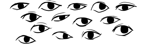
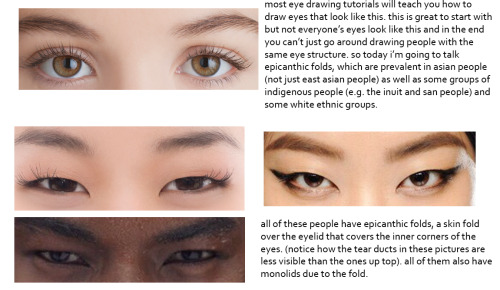
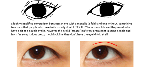

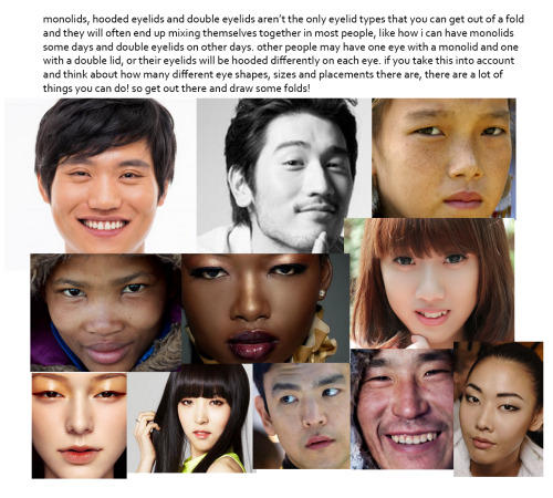
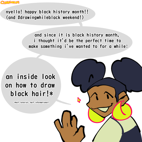
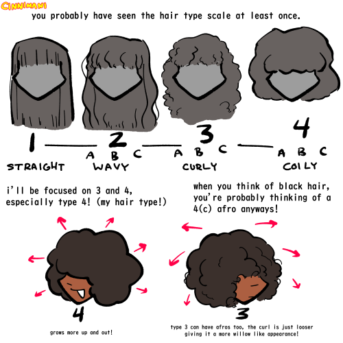
this was gonna be a tutorial and i guess it still is but if anything it’s just a really long and drawn out “essay” on drawing people with epicanthic folds. one of my biggest pet peeves is people drawing asian people exclusively with the same type of eye they’d give white people or anyone else who typically doesn’t have the fold! however i know that most people are taught with the standard white person eye (google image search for “eye” and it’ll all be pictures of white people’s eyes) so learning to draw epicanthic folds is a consciously learned thing.
therefore i bring you this, which attempts to break the mechanics of epicanthic folds down into something that’s a bit easier to digest and implement in your own art!
style can be argued i guess but it’s not that hard to stylize eyes with folds if you do proper observation and research. eyes with epicanthic folds are as diverse as eyes without so it’s not like you have to adhere to a strict model for them (although many people think that you have to) and all it takes to distinguish the two in stylized art (and even in semi/realism once you think about it) is a few lines! like i said this is a learned process but it’ll make your asian characters (and characters of other races even) a bit more interesting and believable.
-
 dandelionscene753 liked this · 1 year ago
 -
 klickkatz reblogged this · 1 year ago
 -
klickkatz liked this · 1 year ago
-
 momus-deus liked this · 1 year ago
 -
 sundreaminstorybrooke liked this · 1 year ago
 -
 siren-nn liked this · 2 years ago
 -
 hounddogmoment liked this · 2 years ago
 -
 maltedroses liked this · 2 years ago
 -
 sweetbriiichan liked this · 2 years ago
 -
 roviniko reblogged this · 2 years ago
 -
roviniko liked this · 2 years ago
-
 guardangst reblogged this · 2 years ago
 -
 lllllllleeee liked this · 2 years ago
 -
 bugbear-bee liked this · 2 years ago
 -
 sassypenguine liked this · 2 years ago
 -
 oceanticspace reblogged this · 2 years ago
 -
oceanticspace liked this · 2 years ago
-
 murdrowll liked this · 2 years ago
 -
 thefairywithfandoms reblogged this · 2 years ago
 -
 shsl-conspiracy-theory reblogged this · 2 years ago
 -
 dorky-muse liked this · 2 years ago
 -
 whitewyrmings reblogged this · 2 years ago
 -
 reirajustrei liked this · 2 years ago
 -
 sassycat-pants reblogged this · 2 years ago
 -
 adonnma liked this · 2 years ago
 -
 somepunaboutspace liked this · 2 years ago
 -
 who-needs-words liked this · 2 years ago
 -
 this-is-your-last-dance liked this · 2 years ago
 -
 comicgirluniverse liked this · 3 years ago
 -
 theprincelyking liked this · 3 years ago
 -
 lilhaileyfoofoo reblogged this · 3 years ago
 -
 corvidaecircus liked this · 3 years ago
 -
 some-name-4-me liked this · 3 years ago
 -
 vampirthedarkone liked this · 3 years ago
 -
 brambleberrybush liked this · 3 years ago
 -
 oh-hootsifer liked this · 3 years ago
 -
 miilkphone liked this · 3 years ago
 -
 toalugia reblogged this · 3 years ago
 -
toalugia liked this · 3 years ago
-
 vampirejuno liked this · 3 years ago
 -
 cronchy-dumbass liked this · 3 years ago
 -
 red-rum-mondays reblogged this · 3 years ago
 -
red-rum-mondays liked this · 3 years ago
-
 snuggly-eve reblogged this · 3 years ago

I mostly reblog writing and art related resources here. BLMMy main account is FoofsterRoonie. My art blog is FoofsterArtAnd my writing blog is Foofsterwriting:)
197 posts